I don't like this. I don't mean to be negative, but there's little good about it.
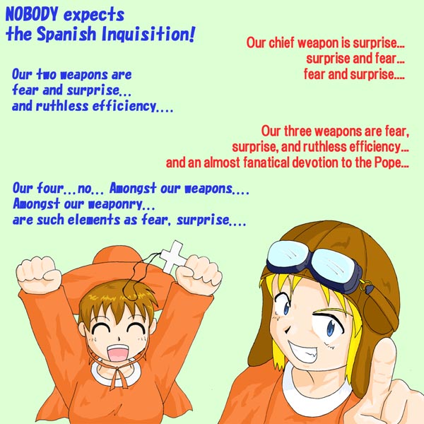
Drawing is overall sloppy and "all over the place"
There's little/no detail on the skin, and where there is, it just looks wrong (example: the finger on the lower right corner looks chubby and not defined at all)
The clothing/cloth is even worse. No detail besides what looks to be vague wrinkles that were just random shapes added in a lower tint of orange.
The shading in this picture is bad. The character on the right has no shading on his hair or inside his hat. There isn't enough shading under the character's necks and hats. The character on the right has bad bright blue goggles that just scream "I was too lazy to make this transparent"
Furthermore, the background is lazily done. Minimalism can be good if the subject of the picture is detailed and well-defined. Here, they subject is not.
Lastly, this Monty Python joke became unfunny after the first 5000 references were made to it.
Gezbab > While I do agree about the technical level being relatively low, I can't help but feel a little uneasy upon reading your commentary. Most of the things you say aren't wrong, but... chances are, the person who drew this are still learning the ropes. I don't mind constructive criticism, but I'm pretty sure saying the artist's "lazy" isn't constructive at all. A quick look upon their gallery seems to confirm an actual lack of skill, and not a lack of will. As odd as it may seem, sculpting light correctly isn't that easy at all, especially for someone who probably doesn't fully understand volumes yet (and I'm pretty sure that's the case here - their other pictures are a little better, but this one's in a different style, meaning the whole light sculpture thing reacts very differently).
Yes, the picture is relatively low-quality stuff when compared to Danbooru's usual level, but don't forget said level is rather high to begin with (without flattering myself, I don't think I'm too bad of an artist, and I'm currently studying art to improve, but... seriously, Danbooru's standard is just too high for me to dare upload any of my artwork here). I'll admit I don't know about the upload policies, though - perhaps what you're criticizing is the fact that the picture was uploaded, because it was too weak for Danbooru's usual quality standard?
Kalista said: Gezbab > While I do agree about the technical level being relatively low, I can't help but feel a little uneasy upon reading your commentary. Most of the things you say aren't wrong, but... chances are, the person who drew this are still learning the ropes. I don't mind constructive criticism, but I'm pretty sure saying the artist's "lazy" isn't constructive at all. A quick look upon their gallery seems to confirm an actual lack of skill, and not a lack of will. As odd as it may seem, sculpting light correctly isn't that easy at all, especially for someone who probably doesn't fully understand volumes yet (and I'm pretty sure that's the case here - their other pictures are a little better, but this one's in a different style, meaning the whole light sculpture thing reacts very differently).
Yes, the picture is relatively low-quality stuff when compared to Danbooru's usual level, but don't forget said level is rather high to begin with (without flattering myself, I don't think I'm too bad of an artist, and I'm currently studying art to improve, but... seriously, Danbooru's standard is just too high for me to dare upload any of my artwork here). I'll admit I don't know about the upload policies, though - perhaps what you're criticizing is the fact that the picture was uploaded, because it was too weak for Danbooru's usual quality standard?
Hoping I wasn't unrespectful to you, Kalista
I agree with you Kalista, while it's not terrible, I don't think this particular piece meets the usual quality accepted here on Danbooru. I'm in the same boat as you as far as being an artist, and I have a strong feeling that in this particular piece it's more of a lack of experience rather than laziness.
 goggles goggles_on_head grin hat monty_python monty_python's_flying_circus pointing simple_background smile spanish_inquisition text_focus tin_tin_banchou rating:s score:-4")