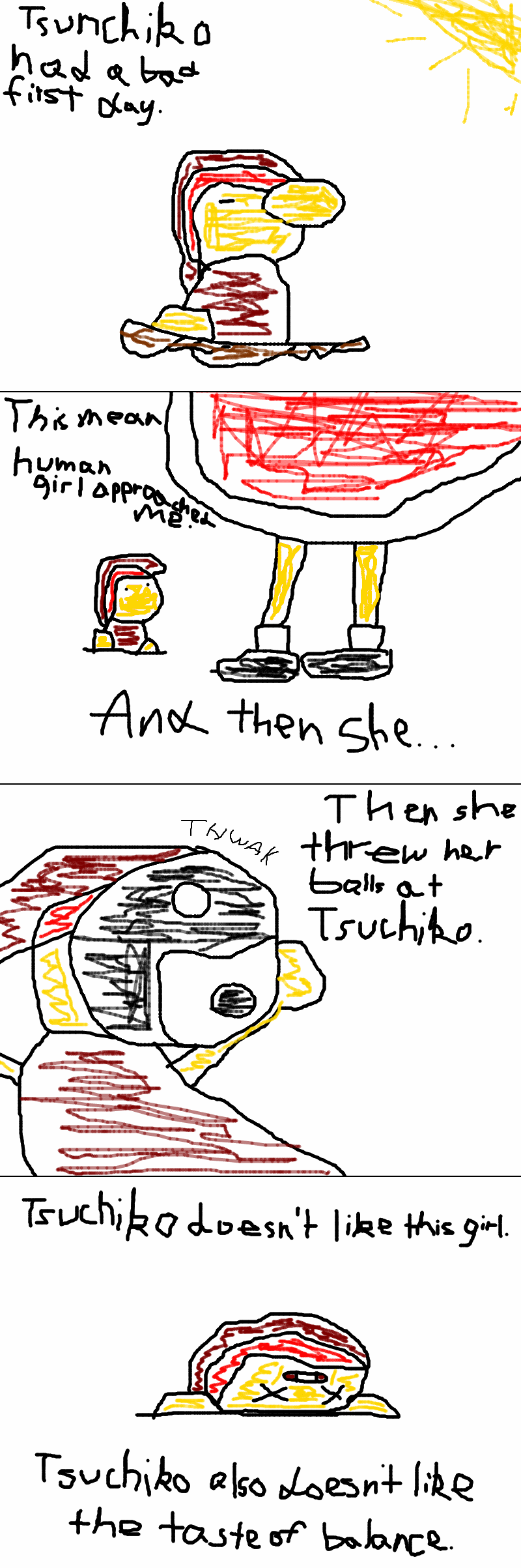
"Once upon a time there is a youkai named Tsuchiko. One day, Tsuchiko meet a human female named Hakurei Reimu. Hakurei Reimu dislikes Tsuchiko. She then threw her yin-yang ball at Tsuchiko. It's VERY EFFECTIVE!! Tsuchiko was defeated. And then, Tsuchiko dislikes Hakurei Reimu and her yin-yang ball. The End."
Well I don't like this pic either. Please delete it.
Well, it's supposed to look like a quick marker drawing (hence the handwriting, crappy outlines, and the scribbled colors), but if it doesn't even look like that I'll delete it.
Still, I'd like some critisism on the overall artwork. Too crappy? Get better colors? If I try this again, I'll see if I can make it clearer on what's going on (perhaps instead of handwritten text, use the program's text feature).
Actually, it's just that it's looked down upon due to the tendency for artists to overlook the crappiness of their artwork (if applicable.) While I knew it was bad, it's intentional though either the effect didn't work, I didn't make it obvious enough show people that it was intended to this effect (a title page probally would've helped, in hindsite), or if it's just too hard to understand (I'm leading towards the latter two).
Oh well, I tested the waters and the vessel just isn't seaworthy. Mods, feel free to purge this indescriminately.
(yes, I'm aware of the other sites but those places tend to crawl with more of the unsavory kind than I perfer)