It's easy with this kind of bubble though And you don't have to give each word its own line because that's not how typing works since you're typing in English, not Japanese, and that typeset above failed even the most basic thing in typesetting
I think you only got the first bubble right. The rest is either too stylized, stretched, small or thin to be comfortably readable. Dialog boxes are supposed to be consistent in font and size at least between the same character dialogues.
I think you only got the first bubble right. The rest is either too stylized, stretched, small or thin to be comfortably readable. Dialog boxes are supposed to be consistent in font and size at least between the same character dialogues.
That's why I've enlarged it a bit and used the largest font size possible so you can zoom in and read just fine, and dialog boxes are NEVER supposed to be consistent in font and size, they have to be stylized to fully express the emotions in it, that's the most basic in typesetting And if you want to prove me wrong, then name a decent artist/ typesetter that uses only 1 font and 1 size to type the dialogues on his works
I see you don't check that many webcomics or printed comics, it's the basic norm. You can practically check the wikipedia page about comics/webcomics and check the examples by yourself. Or maybe you're confusing it with sound effects, totally unrelated to dialog boxes.
With that said stylizing comics is a freestyle form, yet you shouldn't tell your readers "here is the worst size readable font that does look cool, be sure to bring in a magnifier to read it".
No, not only the sound effects but the dialogues are never supposed to be typed in a single font, like normal talking and angry talking, they're never in the same font if the typesetter really knows how to type, many typesetters don't have a collection of fonts just for nothing And the reason why my typing looks small to you is because that is the almost largest size possible without ruining that kind of speech bubble Not sure if you read it on the phone or not but you can read it just read it in the original resolution And this still does not change the fact that the page above is just like a copy then slap the translation on the page then save it, at least you have to arrange it right
Disapointingly poor effort into applying the most basics of norm of text-positioning into practice. Clarifications are rather unecessary since how bad it looks is apparently crystal-clear anyway.
Whatever: I'm just grateful for this, which is far superior to painfully hovering each bubble.
Thanks be to Ido !
Funny, I rather enjoy the mouse-overing, especially since it keeps me from accidentally reading a bubble out of order, and find those that don't keep the original text to be highly annoying...
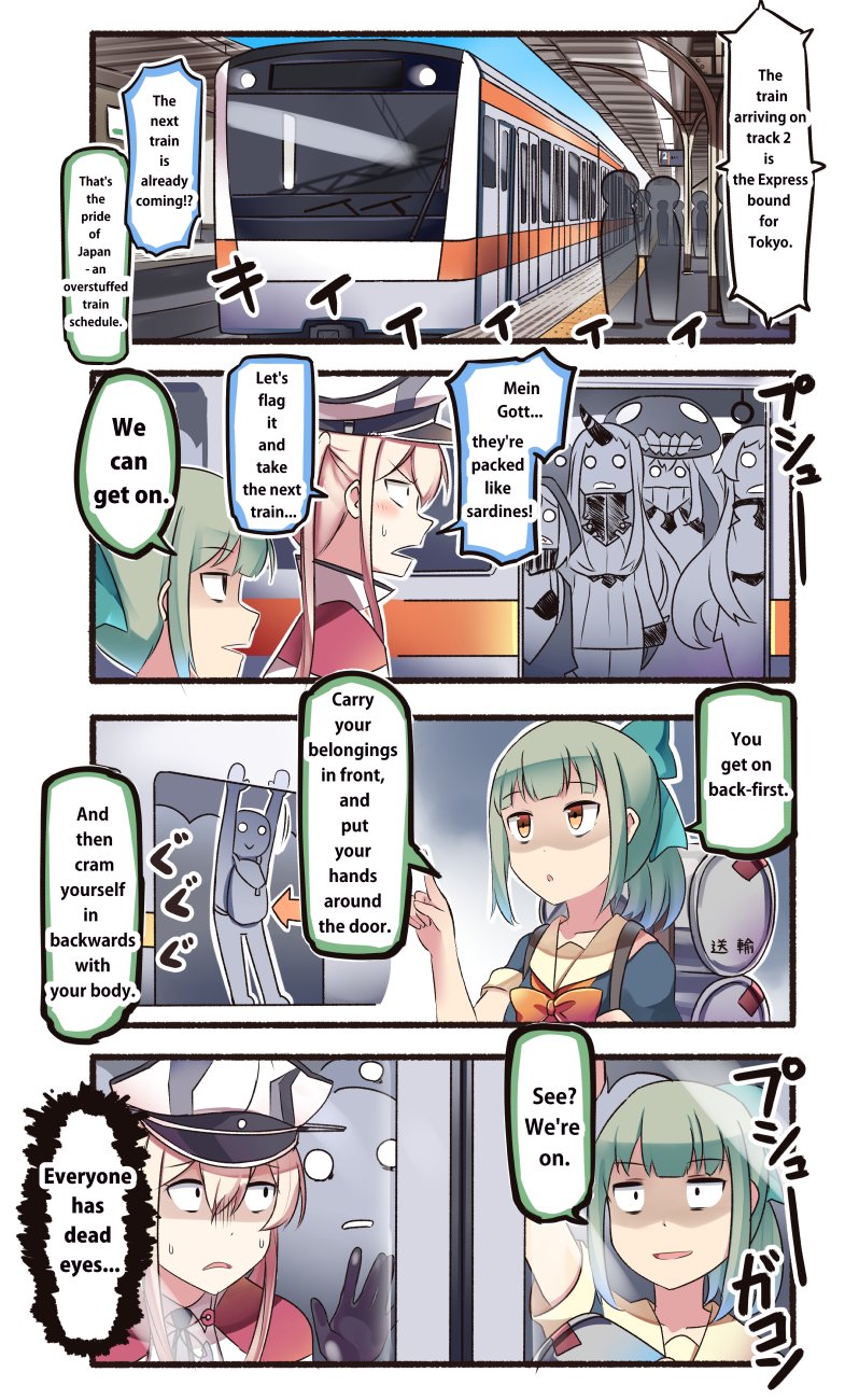
 backpack bag blonde_hair blunt_bangs bow bra brown_eyes comic commentary_request crowded day dress drum_(container) empty_eyes gloves graf_zeppelin_(kancolle) green_hair green_skirt grey_hair hair_bow hair_ornament hat highres holding_strap horns ido_(teketeke) index_finger_raised kantai_collection long_hair military_hat multiple_girls o_o open_mouth parted_lips peaked_cap ponytail profile re-class_battleship revision sanpaku school_uniform seaport_princess serafuku shaded_face single_horn skirt sliding_doors subway subway_station tactile_paving train train_station translated truth underwear very_long_hair white_hair wo-class_aircraft_carrier yuubari_(kancolle) rating:g score:8")